House of Maivan Chocolates

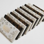
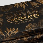
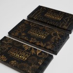
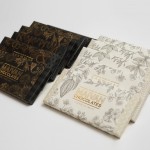
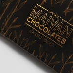
Key brand values to communicate were: hand-made, specialty, sophisticated, and natural ingredients. Since these are hand-made luxury chocolate bars from a small artisan chocolaterie, the production costs for the packaging needed to be kept at a minimum. So the challenge was to achieve a high-end appeal at the lowest cost possible. The sleeves were designed to use only 2 spot colours, including a gold ink, and printed on a thin uncoated stock, while the wrappers require only 1 spot colour on a tinted stock.
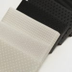
Hand-drawn botanical illustrations, reminiscent of botanical diagrams, were incorporated into the sleeve design to surround the metallic logo and type treatment. Underneath, each flavour is wrapped with it’s own pattern to add a quirky and modern appeal, proudly suggesting that each bar is a gift from the family, to you.
Tools: Photoshop, Indesign, Ink Pen
Date: 2013
Process


